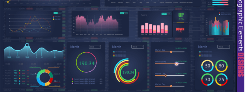
Visual analytics tools are constantly evolving and offering powerful features for improved accessibility and excellent user interface. We need data, more than ever to back up our operations and business decisions. Therefore, the visual analytics tools help you to sort data and allow you to follow key trends.
Visual analytics tools display thousands of rows and columns of data into charts, bars, and comparison tables. Visual analytics tools make it easier to decipher and understand the current trends at a glance. If you are not a data scientist, visual analytics tools might help you to decipher tons of data without consuming too much time.
( Also Read: What is Visual Analytics? )
Best Visual Analytics Tools
Let’s look at some of the best visual analytics tools that have taken over the market with advanced features, in-depth analysis engines, and multiple other benefits:
-
Board
Board is a popular tool that offers a wide range of widgets, maps, charts, data views, and comparison tables. Board organizes the data set for proper representation and storyboarding.
Board offers advanced yet interaction dashboard and charting features. Moreover, the maps in Board lets you focus on certain factors to get spatial insights.
You can build an intuitive dashboard and access customized analysis reports by using the advanced features of Board.
The platform includes an automated predictive model for precise and accurate analysis and forecasting.
-
Tableau
Tableau data visualization solution enables the users to design and analyze intelligent yet informative business reports using the feature of storyboarding. You can also use animated forms to present data in intelligent business reports.
The new spatial file connector tool supports geospatial interaction, which allows users to take advantage of the data separated by geolocations.
Tableau is capable of performing predictive, descriptive, and prescriptive analysis via the CFO dashboard.
-
Spotfire
Spotfire offers 16 types of data visualization options including network graphs, heat maps, pie charts, and maps. It offers a wide variety of visualization options to spot valuable patterns and trends.
Users can communicate complex concepts with each other by using step-by-step navigation and descriptions.
The geospatial feature allows the users to view maps and establish immediate connections for future outcomes. This solution uses regression and statistical models to view predictive analytics and insights.
-
SAS Visual analytics
SAS visual analytics tool provides an interactive and dynamic intelligence solution for the users to create storyboards. SAS allows you to map all the actions before analyzing the data. The Microsoft Office integration enables easy storyboarding and collaboration within the software.
The auto-charting feature starts mapping from an ideal point and continues the graph by using real-time data.
-
Power BI
Power BI’s pre-built dashboards and unify all the dimensions and metrics into a single view to show real-time updates and insights.
The scorecards within the software include guided navigation, visualization, and precise filtering. It also suggests the animation options and data visualization types to present data in line with the business requirements.
Final Thought
Before deciding on a specific data analytics software for your organization, make sure to go through the comparison report and weigh the pros and cons of the software on this list.